

The adaptive vs responsive design debate over making sites look good on different screens is nearly as old as the iPhone. The main differences are simple:
- Responsive design flows and adjusts to fill any context
- Adaptive design is more bespoke and can change depending on the context
In short, responsive design offers flexibility across all devices, while adaptive design provides more tailored experiences for specific breakpoints. The right choice depends on your goals, resources, and how much control you want over the user experience.
Why This Topic Still Confuses Designers?
So, why the persistent confusion? Possibly because both approaches aim for the same goal: a great user experience on any device. They just take different paths to get there.
The lines have also blurred over the years as hybrid approaches that mix techniques from both sides have become more popular.
That said, the stakes are too high for there to be any more confusion, especially as over 64% of global internet traffic nowadays comes from mobiles. So if your site doesn’t work well on a phone, it practically doesn’t exist for most of your audience.
We’re going to:
- Break down what each term means
- Explore the key differences that matter
- Give you practical advice on when to use each one
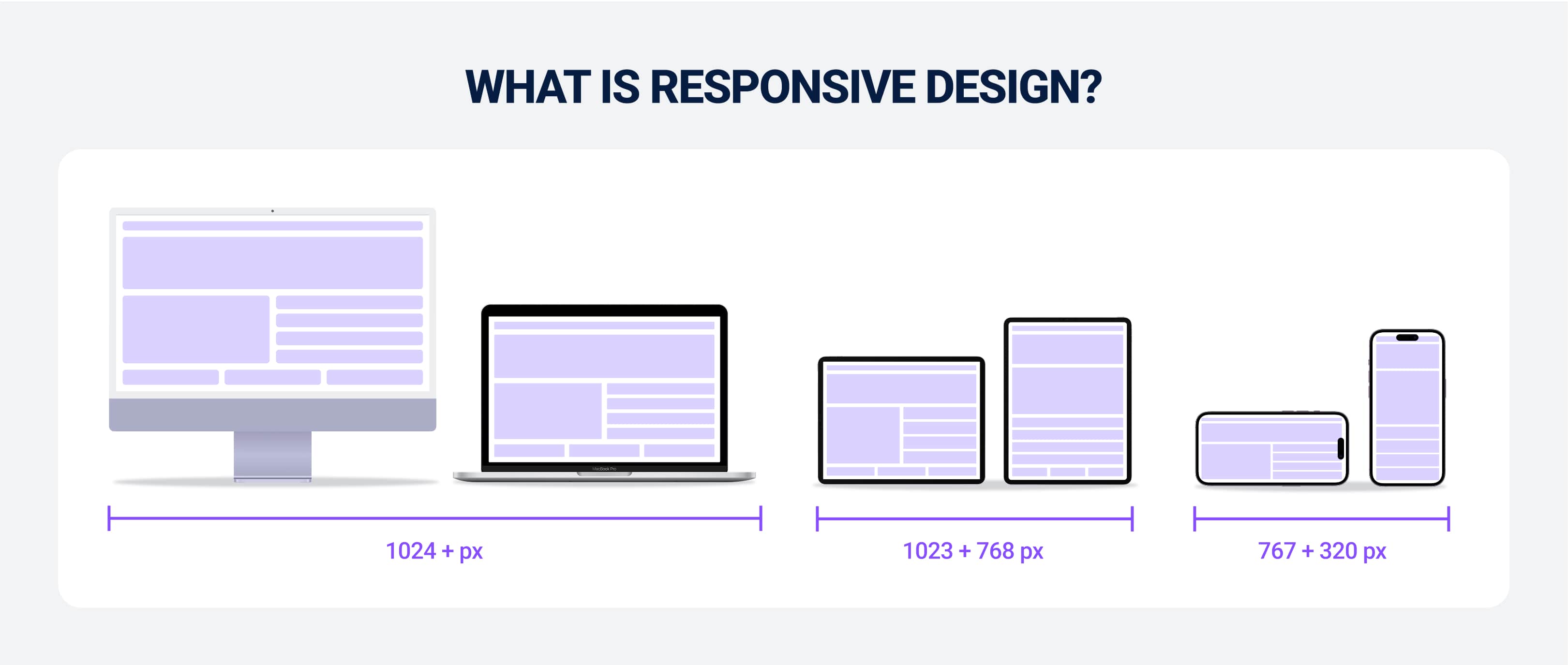
What Is Responsive Design?
Responsive Web Design (RWD) is the more common approach. This aims to build one website that fluidly adapts to every possible screen size. It does this through:
- A flexible grid system
- Fluid images
- CSS media queries that automatically rearrange content
It’s one single, flexible layout. Like if you shrunk the browser window you’re reading this article on now, you’ll see how the content dynamically shifts and reorganizes itself so it fits the new space.
Some of the elements might stack, and the navigation might turn into a hamburger menu, but it’s all the same underlying HTML code, just with different CSS rules applied.
The goal is to give the user a consistent experience, from people scrolling on their tiny smartphone to a massive 4K monitor.
It’s also just the industry standard for most new projects. It’s nice and efficient, but more importantly, Google gives it a big thumbs-up in terms of SEO. We’ll touch on the cost for responsive web design later, but that efficiency point is also a big draw.
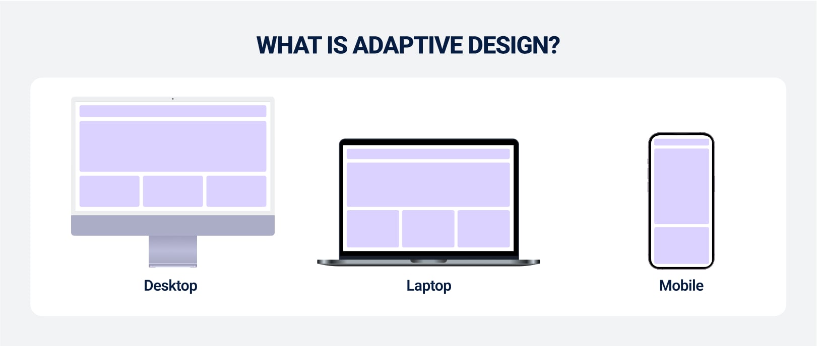
What Is Adaptive Design?
Adaptive Web Design (AWD) is different because you create several fixed layouts tailored to a specific screen size or “breakpoint” rather than just one fluid layout. The server detects the user’s screen resolution when they visit your site and gives them the appropriate pre-designed layout.
Common breakpoints for adaptive design often include:
- 320px (small smartphones)
- 480px (landscape smartphones)
- 768px (tablets)
- 1024px (laptops/desktops)
- 1600px+ (large monitors)
That example we gave before about how responsive design changes if you resize your browser window between these breakpoints doesn’t apply to adaptive layout. It “snaps” into the next layout only when it crosses a set pixel threshold.
This approach gives you massive control over the user experience for each specific device type because you're not just reflowing content. That means you can deliver completely different experiences. Companies like Amazon famously use adaptive approaches so the shopping experience feels more tailored to the user.
Key Differences between Adaptive vs Responsive
The differences are ostensibly subtle, but in practice, they have huge implications for:
- Development
- Maintenance
- UX
- Performance
Flexibility vs Control
This is the heart of the whole adaptive vs. responsive debate. Responsive design is all about flexibility. You’re giving some of that control to the browser so the content can flow and adapt to any screen. Even ones you haven’t anticipated. So the layout is fluid and determined by percentages and relative units.
Adaptive design, on the other hand, is about control. You, the designer, decide exactly how the site should look at key resolutions. This allows for pixel-perfect optimization for your audience's most common devices.
You can sort every element on your site so that it’s perfect for a mobile phone. Then, you can completely change this for a desktop user.
Code Complexity and Time to Launch
A responsive site is built on a single codebase. All the logic is handled client-side by CSS. This means you have a more streamlined development process once the initial framework is in place, since there’s only one set of HTML to manage for all devices.
Adaptive design requires maintaining multiple distinct layouts. This can add significant complexity and increase development time, as you are essentially designing and building several versions of your site.
This directly impacts project timelines and answers the question of how long does web design take — adaptive projects almost always take longer.
Performance by Device Type
Here’s where adaptive design can really shine. Because it serves a layout specifically for the user’s device, it can be optimized to only load the assets needed for that screen.
Mobile users get a lighter, faster version without downloading the high-resolution images meant for a desktop display. Research from the Interaction Design Foundation suggests adaptive sites can be 2-3 times faster than their responsive counterparts.
But responsive sites usually have to load the entire set of assets for all screen sizes and then just use CSS to hide what’s not needed. This leads to slower load times on mobile devices. Hence why a company that’s as hyper-fixated on UX as Amazon uses adaptive designs.
That said, a few techniques, such as responsive images and lazy loading, do a decent job of closing this performance gap.
UX Consistency Across Screens
With responsive design, your users get the same experience across all devices. This comes with a consistent, familiar look and feel for your website, which is great for branding.
The navigation and core components behave similarly everywhere, just in a different arrangement.
Adaptive design is a bit less consistent, but it trades that for a more optimized experience. So, the mobile version might prioritize different features or content than what you see on the desktop version, but that could be based on the assumption that your users have different intentions depending on which device they’re on.
Like how most people use social media on their mobile, but many people are more comfortable booking a holiday/flights on a desktop.
This can be powerful if your user data supports it, but it can also be jarring when the experiences feel like two completely different websites.
Long-Term Maintenance and Scalability
Another thing is that the overall maintenance involved in keeping a site running well tends to be simpler with a responsive design. With a single codebase, any content update, bug fix, or feature addition is reflected across all devices simultaneously. It’s a “one and done” deal.
Adaptive sites require more upkeep. An update might need to be implemented across multiple layouts, which increases the risk of inconsistencies and bugs.
If a new popular screen size emerges (like a new foldable phone), you have to build a whole new layout to support it, whereas a responsive site would likely handle it without any changes.
| Feature | Responsive Design | Adaptive Design |
|---|---|---|
| Layout | Fluid, flexible grid | Fixed, multiple layouts |
| Approach | One-size-fits-all, flows to fit | Tailored layouts for specific devices |
| Control | Less pixel-level control | High control over each layout |
| Codebase | Single HTML/CSS codebase | Multiple HTML/CSS layouts |
| Maintenance | Easier, update once | More complex, update each layout |
| Performance | Can be slower on mobile | Often faster, loads only needed assets |
| SEO | Highly recommended by Google | Can be tricky due to multiple versions |
Responsive Design: Pros and Cons
Responsive design became the industry standard for a reason. It’s undeniably got its benefits, but there are still a few cons that we feel are worth discussing:
Flexible, Scalable, and SEO-Friendly
The biggest pro is its flexibility. As touched on earlier, responsive websites are made so they look great on any screen. That even extends to screens that don’t exist yet (remember that example of how if a new foldable phone dropped tomorrow, then responsive websites would be completely fine?)
This makes it incredibly scalable. And again, quite “future-proof.” Google has also been a major advocate for responsive design since the “Mobilegeddon” update in 2015. Primarily because it’s easier for their crawlers to index a single URL. So you’re getting an SEO advantage without even trying if you make a responsive site.
Single Codebase Across All Screen Sizes
Having one set of code to manage is a huge win for website development teams. It simplifies everything from initial build to ongoing maintenance and updates. It reduces complexity, which can lower the long-term UX UI design cost associated with a project.
WE ARE A REVENUE-GENERATING UI/UX & WEB DESIGN AGENCY
Your website is your first impression. With functional design, clean code, and seamless UX, we build high-converting websites.
Let's talk - Schedule a call with our expert team today to see how we can help!
Better Compatibility With Modern Frameworks
A decent amount of modern CSS frameworks and content management systems (CMS) are made to be responsive. WordPress and Shopify are good examples of this.
That’s because frameworks like Bootstrap and Tailwind CSS have been designed to make building responsive layouts fast and efficient. This is the industry standard, so all the infrastructure around it just works. And popular visual builders like Webflow make it almost effortless. So starting new projects with all this widespread support is much easier.
Future-Proof for New Devices
Any new phone or tablet with a different screen size from an iPhone can enter the market and a responsive site will continue to work. It’s fluid, which means you don’t need to figure out how to manually update it for every new device.
You’d be there all day if you had to create a million different versions of your site for every potential phone size, so this way, you’re avoiding all that.
Less Precise Control Over UI
Unfortunately, with all that flexibility, you are sacrificing some control. Ideally, you want a pixel-perfect design across every possible screen width, but it can be challenging (if not impossible) because the layout is always changing.
An element that looks great on a 400px wide screen can easily look awkward at 450px. And you have to design for that unpredictability. Not easy.
May Struggle on Older Devices or Ultra-Wide Screens
It’s hard to argue against using a system as powerful as the complex CSS that goes into responsive design. Still, it can be a struggle for older, less powerful smartphones.
That inevitably leads to slow performance. People will likely click off your site if it takes longer than three seconds to load. You don’t want to risk jeopardizing a stream of potential customers because they don’t have the latest iPhone.
Even on the other end of the spectrum, fluid layouts can stretch content to a point where it becomes unreadable or looks strange on ultra-wide desktop monitors.
Requires More Upfront Planning
Most web traffic comes from mobile devices, so you need a “mobile-first” mindset to build a proper responsive site.
That means designers and developers need to think holistically about how content hierarchies and user flows will adapt across various devices.
You can’t just make a desktop site and “squish” it into a mobile screen.
Adaptive Design: Pros and Cons
Adaptive design might be less common for new projects, but it’s still an incredibly powerful tool when used in the proper context. Your main focus here is on precision and optimization, but there are few cons that come with that that we’ll get into soon.
Optimized UX per Device
This is the best part about adaptive design. Every device gets a perfectly optimized experience since you’re making separate layouts for each one of them.
That means you can have a touch-friendly mobile interface with large buttons and simplified navigation. Then, for the desktop version, you can add a few more detailed menus and a denser information layout.
Faster Load Times for Targeted Resolutions
Adaptive sites only send the assets that are needed for whatever one device being used. That makes it significantly faster. Mobile users don’t have to download heavy desktop images. Desktop users don’t get code intended for mobile.
This speed can make a huge difference in conversion rates and user satisfaction in any situation where performance is one of the most important factors (which it is in many circumstances!).
Ideal for High-Value or Device-Specific Applications
Adaptive design is best when you need to retrofit an older website for mobile and don’t want to undergo a complete rebuild.
It’s also solid if you know the user’s task will be fundamentally different on mobile vs. desktop. So a mobile banking app might want to prioritize quick balance checks and transfers, while the desktop version focuses on detailed statement analysis and financial planning tools.
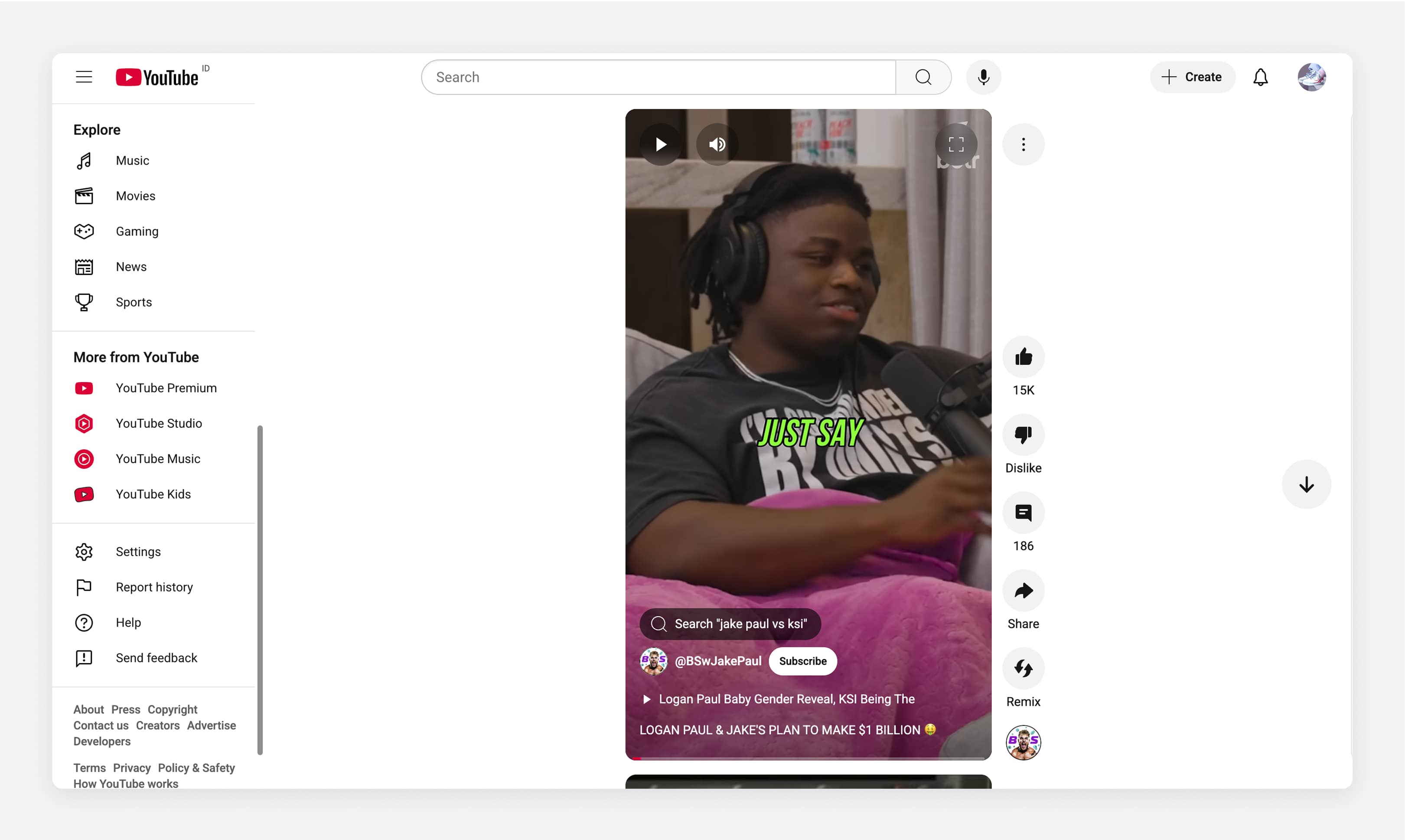
Same with the whole ‘TikTok-ification’ of video content (both adverts and entertainment). Ever looked at an Instagram Reel or YouTube Short on a computer? It looks way different than it does on mobile:
Requires Multiple Layouts
The most obvious drawback is the workload. You have to design and test multiple distinct layouts, which is a significant amount of effort. It requires more resources and, consequently, a higher budget. This distinction is often discussed in the context of digital design vs. graphic design, as it involves both visual and structural engineering in multiple contexts.
More Dev Time, Higher Cost, Harder to Maintain
Again, the increased complexity translates directly into higher costs and more difficult maintenance.
Every change you want to make needs to be designed and then tested across all layouts. This can be a massive expense, especially for smaller teams.
And you better hope a bug doesn’t appear as it’ll set you back some amount of time while you investigate which layout is affected and that whatever fix you implement doesn’t break another one.
Can Feel Outdated When Not Done Well
Adaptive layouts are made for specific breakpoints, which means they’ll end up being clunky on any devices that don’t have a screen size you’ve accounted for. You’d have to make a brand new design for that specific device.
Your site will look dated if you don’t do this. In this case, they’ll usually be shown an old layout that doesn't fit properly, which is just bad UX design.
Responsive vs. Adaptive: Which Design Approach Should You Use?
Choosing between responsive and adaptive design depends on things like your goals, resources, and user needs. In this section, we’ll walk through when each method makes the most sense.
Use Responsive if You Want Universal Access and Easier Maintenance
Responsive design is generally the way to go for the vast majority of websites. So that includes:
- Blogs
- Corporate sites
- Informational portals
- Standard ecommerce stores
It's a “build once, display everywhere” approach. The main benefit is the fact that your users all get a consistent experience, but the way it simplifies your maintenance and update responsibilities isn’t to be sniffed at either.
Use Responsive for Blogs, SAAS Dashboards, and CMS-Driven Sites
Use something like WordPress (CMS-driven) or want to build a SaaS application that has the same functionality across multiple devices? Go responsive.
The content and features are consistent. And that responsive framework means you go straight to application logic stuff instead of reinventing the UI for every device (which takes a long time).
Running a responsive blog or SaaS product? Our affiliate marketing solutions can improve your reach and revenue.
Use Adaptive for High-Control Product UIs and Performance-Sensitive Apps
Adaptive design really counts when every pixel and millisecond matters. Picture an online trading dashboard where buy and sell orders flash across the screen, or a streaming service on set-top boxes where menus must feel instant.
You’re able to avoid dumping a huge responsive bundle on a low-powered smart TV or budget tablet since it detects the device on the server and ships only the HTML, CSS and JavaScript each device needs.
And if you think a few hundred milliseconds won’t move the needle, Amazon’s data tells a different story; every extra 100 ms of latency cost them 1% in sales. And again with that Google example, half of your visitors bail if a page takes more than three seconds to load. Adaptive templates help you give only the most necessary code, so that’s a huge edge for performance-sensitive apps.
Use Adaptive When Designing for Specific Screen Types or Devices
Developing a UI for Apple Watch versus Android TV is a whole new interaction language. Not just a matter of dimension. A round display needs tap targets that are arranged in a circle; a car’s infotainment system can’t exactly rely on pinch-to-zoom because you’re in a different environment than walking down the street.
With adaptive design, you sniff out the device family or screen type and provide a bespoke layout that feels native.
Use Adaptive in Industries With Strict Interface Constraints
When your interface must follow FDA regulations or ISO standards, you can’t leave layout and typography to chance.
Documented design controls have to be met, from medical infusion pumps and cockpit displays in aviation even to point-of-sale terminals in regulated environments.
The FDA’s 21 CFR 820.30 mandates rigorous processes for every button, font size and flow. Adaptive design lets you bake those constraints into each device template rather than bolt on overrides.
Final Takeaways
For most people, most of the time, responsive design is the clear winner. It’s:
- Efficient
- Cost-effective
- SEO-friendly
- Ready for whatever the future of the web throws at it
But don’t discount adaptive design. Its precision and speed are helpful in the right situations (for highly controlled user interfaces or complex web apps).
The best designers and developers don’t consider this a rigid binary choice. They see it as a spectrum. They build on a responsive foundation and then layer in a few adaptive principles where it makes sense. They ask the right questions: Who is our audience? What are they trying to accomplish on each device? And what is the most direct path to help them get there? That mindset leads to smarter, more user-focused design, not just for today’s devices, but for whatever comes next.
Frequently Asked Questions
Which Is Better for Mobile User Experience, Adaptive or Responsive Design?
If you need broad coverage with minimal maintenance, Responsive is your go-to. If you care more about performance or strict compliance, adaptive pays off. Most high-impact projects combine them: a responsive grid under the hood, with adaptive bundles for heavy or critical components.
How Does Responsive Design Handle Screen Size Changes?
Responsive uses CSS media queries. At runtime, when the viewport crosses a breakpoint (say from 767 px to 768 px) it applies new styles. Images are resized and columns collapse. It’s fluid, but everyone still downloads the same assets, even if they end up hidden or shown.
Does Adaptive Design Use Fixed or Flexible Layouts?
Adaptive centers on fixed breakpoints (320 px, 768 px, 1024 px, for example) and serves completely separate templates at each. Those templates can use flexbox or grid internally, but the big picture is predefined: you know exactly which markup and assets go out for each range.
Is Responsive Design More SEO Friendly Than Adaptive?
Generally, yes. Google has explicitly recommended responsive design as its preferred method for mobile-friendly sites. This is because a responsive site uses a single URL, which makes it easier for Google’s bots to crawl and understand the content without encountering duplicate content issues that can sometimes arise with separate adaptive versions.
Which Design Type Loads Faster on Mobile Devices?
Adaptive tends to be a bit better here as you strip out desktop-only scripts and heavy animations from the mobile template. A responsive approach often ships everything, then just hides or scales it client-side.
Can I Combine Adaptive and Responsive Techniques?
Yes. That’s actually often the smartest route. Use a responsive layout system for general flow, then add a few adaptive image sets or even alternate navigation patterns server-side once you detect the device.
Which Is Easier to Maintain, Adaptive or Responsive Websites?
Responsive tends to be simpler: one stylesheet, one markup. Adaptive needs parallel templates, which can double QA and versioning work. But if you’re chasing performance targets or strict design requirements, the extra upkeep can usually pay for itself in conversions and compliance.
What Tools or Frameworks Support Responsive Design Best?
Tailwind CSS has built-in responsive utilities that read like shorthand. Bootstrap’s grid system handles most breakpoints out of the box. Then on the component side you’ve got React libraries like Material-UI that let you pass responsive props to everything.
When Should I Choose Adaptive Design Instead of Responsive?
Go adaptive when you need: pixel-perfect UIs, fast performance or to meet strict regulatory guidelines. It’s especially useful when you want to fully control how your content appears on specific devices, like tailoring a high-end app experience for tablets versus phones.